Why you can trust Sunlight Media
- Expertise and Experience:Our content is crafted by seasoned professionals with extensive experience in digital marketing, ensuring you receive accurate and actionable advice.
- Unbiased Information:We provide impartial insights and recommendations based solely on what's best for your business, without any hidden agendas or promotions.
- Thorough Research:Our articles are backed by comprehensive research and the latest industry trends, ensuring you stay informed with reliable and up-to-date information.
- Transparency and Honesty:We believe in complete transparency. We disclose our sources, methodologies, and any potential conflicts of interest, so you can trust the integrity of our content.
- Continuous Improvement:We constantly review and update our content to reflect the latest developments in digital marketing, so you always have access to the most current and relevant information.

In 2024, web design is evolving to meet the demands of a more interactive and visually appealing user experience. This year’s trends emphasize a blend of creativity, functionality, and user engagement. From the subtle charm of micro animations to the bold impact of vibrant colors and custom illustrations, these trends are shaping the future of web design. Whether it’s the sleek aesthetics of dark mode, the engaging nature of gamified designs, or the depth added by parallax scrolling, designers have a rich palette of tools to create captivating websites. Let’s dive into the top trends transforming the digital landscape.
Emerging Web Design Trends for 2024

The landscape of web design in 2024 is shaped by innovative trends that focus on user engagement and aesthetic appeal. A key trend is the use of micro animations to subtly enhance interaction and custom illustrations to create unique visual identities for brands. Dark mode continues to be popular, providing a sleek, modern look while reducing eye strain. Minimalism, with its emphasis on monochromatic schemes and ample white space, remains influential, creating clean and focused experiences.
Interactive elements are also taking center stage. Scrolling animations and gamified designs captivate users, while dynamic cursors and voice-activated interfaces add new levels of interactivity. Bold colors and gradients make a vibrant impact, and 3D elements bring realism to digital interfaces. Storytelling through web design is gaining traction, with kinetic typography and interactive narratives enriching the user journey. These trends collectively push the boundaries of creativity and functionality in web design.
Micro Animations: Enhancing User Engagement
Micro animations are a prominent web design trend that significantly enhances user engagement. These animated elements guide users through web pages, ensuring a visually appealing and interactive experience. By using kinetic typography and dynamic cursors, web designers can create meaningful interactions that capture users’ attention. Incorporating custom graphics and visually striking designs, such as animated illustrations, can make a website’s design stand out. Implementing these design elements helps in maintaining a fresh and modern web design trend, catering to the preferences of website visitors and improving overall website performance.
Custom Illustrations: Unique Visual Identity
Custom illustrations are a vital aspect of modern web design, offering a unique visual identity that sets websites apart from competitors. Utilizing custom graphics and animated illustrations, web designers can create a visually interesting and engaging experience for site visitors. These design elements help in conveying a brand personality and story, making the website more memorable. For businesses looking to create a distinctive digital presence, exploring NFT design services can also add a unique edge to your branding. Incorporating visually striking and eye-catching typography, alongside custom illustrations, enhances the overall digital aesthetics and ensures the website design is both compelling and effective in capturing users’ attention.
Importance of Dark Mode in Modern Web Design
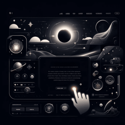
Dark mode has become one of the most prominent web design trends due to its visual appeal and functional benefits. It offers a sleek, modern aesthetic that can make design elements like custom illustrations and animated elements stand out. The use of dark backgrounds can enhance the visibility of other design elements, creating a visually striking and engaging experience for site visitors. This trend also aligns with the modern web design trend of minimalism, using negative space effectively to create a clean and focused interface.
Furthermore, dark mode contributes to better website performance by reducing eye strain and extending device battery life, especially on mobile devices. As web designers continue to explore the latest web design trends, the inclusion of dark mode can cater to user preferences for personalized browsing experiences. This trend not only enhances the digital aesthetics of a website but also improves user engagement by offering a comfortable viewing experience. Integrating dark mode into a website’s design can capture users’ attention and encourage longer site visits, ultimately contributing to the overall success of the website.
Benefits of Dark Mode for User Experience
Dark mode offers several key benefits for user experience, making it an essential feature in modern web design. One of the primary advantages is the reduction of eye strain, especially in low-light environments, which enhances user comfort during prolonged browsing sessions. Additionally, dark mode can contribute to improved battery life on OLED and AMOLED screens, making it a practical choice for mobile devices. This mode also emphasizes design elements and content, creating a visually appealing contrast that can help guide users’ attention and improve readability. By incorporating dark mode, web designers can create a more user-friendly and aesthetically pleasing website, ultimately boosting user engagement and satisfaction.
Implementing Dark Mode Effectively
To implement dark mode effectively, web designers should focus on contrast and readability. Choosing the right color palette is crucial; use shades of gray for backgrounds and avoid pure black to reduce eye strain. Highlight important design elements with vibrant or muted colors that stand out against the dark background. Ensure that text remains legible by using light text on dark backgrounds and testing across various devices and web browsers. Incorporating dark mode toggle options allows users to switch between light and dark modes, enhancing user experience by catering to individual preferences.
Minimalism in Web Design
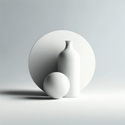
Incorporating minimalism effectively involves careful consideration of each design element. Using a monochromatic color palette and simple typography can enhance readability and create a cohesive look. Interactive elements, such as micro animations, can be used sparingly to add subtle engagement without overwhelming the user. Additionally, a minimalist design can improve website performance by reducing load times, which is particularly important for mobile devices. By prioritizing simplicity and usability, minimalist web design helps guide users through a seamless and enjoyable browsing experience, ultimately increasing user satisfaction and engagement.
Clean Aesthetics with Monochromatic Designs
Monochromatic designs are a hallmark of clean and modern web aesthetics, focusing on a single color palette to create a cohesive and visually appealing interface. By using different shades, tints, and tones of one color, web designers can achieve depth and interest without overwhelming the user. This approach simplifies the visual hierarchy, making it easier for site visitors to navigate and understand the content.
The use of monochromatic designs aligns with the minimalist trend, where less is more. This style not only enhances readability but also highlights key design elements, such as custom illustrations or important calls to action, by contrasting them subtly within the same color family. Additionally, monochromatic designs can adapt to various brand personalities, ensuring a consistent and polished look across all web pages. This method also facilitates a faster design process and maintains a uniform appearance, which can be particularly beneficial for brands aiming to establish a strong visual identity.
Utilizing White Space for Better User Focus
White space, or negative space, is a crucial element in modern web design that enhances user focus and readability. By strategically incorporating white space around text and design elements, web designers can create a clean, organized, and visually appealing interface. This minimalist approach helps guide users’ attention to important content and interactive elements, reducing cognitive load and making navigation intuitive. Proper use of white space not only improves the overall aesthetic of a website but also enhances user experience by creating a more breathable and engaging environment for site visitors.
Interactive Elements in Web Design
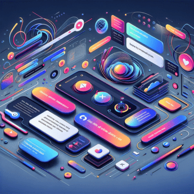
Interactive elements are transforming web design by enhancing user engagement and creating memorable experiences. Features such as scrolling animations and dynamic cursors make navigation more engaging, encouraging users to explore more content. Gamified design elements, like interactive quizzes or games, add an entertaining layer to websites, making them more enjoyable for visitors. These interactions not only capture users’ attention but also provide meaningful feedback, guiding users through the site seamlessly.
Incorporating interactive elements requires careful consideration of user behavior to ensure they complement the overall design without overwhelming the user. For instance, micro animations can subtly highlight important actions or features, while kinetic typography can bring text to life, making the content more dynamic and engaging. Custom illustrations and animated elements can further enhance the user experience by adding visual interest and storytelling capabilities. By integrating these interactive features thoughtfully, web designers can create websites that are not only visually appealing but also highly functional and user-friendly.
Scrolling Animations and User Interaction
Scrolling animations play a pivotal role in enhancing user interaction by creating a dynamic and engaging browsing experience. As users scroll through a webpage, animations can reveal content progressively, making the exploration of information more intuitive and enjoyable. This technique adds depth and visual interest, guiding users’ attention to key elements and improving overall usability. Effective scrolling animations strike a balance between aesthetic appeal and functionality, ensuring that they enhance the user’s journey without causing distractions or overwhelming the interface.
Gamified Design: Engaging Your Audience
Gamified design integrates game-like elements into web design to enhance user engagement and create a more interactive experience. By incorporating features such as points, badges, leaderboards, and challenges, websites can motivate users to interact more deeply with the content. This approach not only makes the browsing experience more enjoyable but also encourages users to return frequently, fostering loyalty. Gamification can transform mundane tasks into compelling activities, effectively capturing and maintaining the attention of the audience while driving user participation and satisfaction.
Utilizing Bold Colors and Gradients
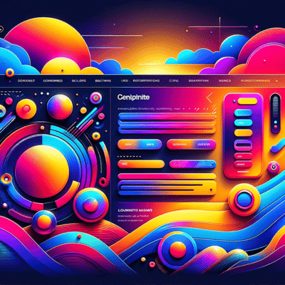
Bold colors and gradients are powerful tools in modern web design, capable of creating visually striking and memorable websites. Using vibrant, contrasting colors can draw attention to key elements, making calls to action and important information stand out. Gradients add depth and dimension, creating smooth transitions between colors that can lead the user’s eye across the page. This technique can also evoke specific emotions and set the tone of the site, enhancing the overall user experience.
When implemented thoughtfully, bold colors and gradients can significantly enhance a website’s visual hierarchy. They can be used to differentiate sections, highlight interactive elements, and guide users through the content seamlessly. This approach aligns with the design trend of creating visually engaging and dynamic web pages that keep site visitors interested and engaged. Additionally, bold colors and gradients can help convey a brand’s personality and identity, making the website not only functional but also visually cohesive and representative of the brand’s values.
Impact of Vibrant Colors on User Engagement
Vibrant colors significantly impact user engagement by capturing attention and evoking emotions. Bright, bold hues can create a dynamic and energetic feel, encouraging users to explore and interact with the website. These colors help highlight essential elements such as calls to action, making them more noticeable and increasing the likelihood of user interaction. Additionally, vibrant colors can reinforce brand identity and make the website more memorable, ultimately enhancing the overall user experience and fostering a stronger connection with the audience.
The Rise of 3D Elements in Web Design
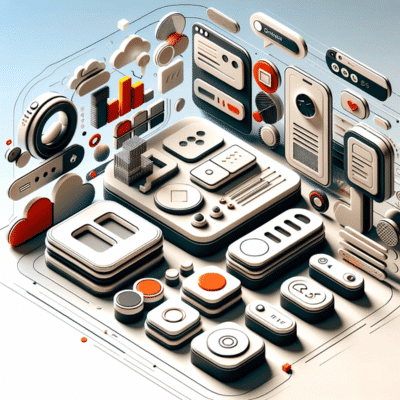
The rise of 3D elements in web design has revolutionized the visual landscape of websites, adding depth and realism that static images cannot achieve. Modern web design trends now frequently incorporate 3D graphics, animations, and interactive elements, creating a more immersive experience for site visitors. These elements not only enhance the aesthetic appeal but also improve user engagement by providing a dynamic and engaging interface that captures users’ attention and keeps them exploring the site longer.
Web designers are increasingly leveraging advanced technologies to integrate 3D elements seamlessly into their designs. This trend aligns with the demand for more visually striking and interactive websites that stand out in a competitive digital landscape. By utilizing 3D elements, designers can create unique visual narratives that reflect brand identity and convey complex information more effectively. As a result, 3D elements have become a cornerstone of modern web design, pushing the boundaries of what is possible and setting new standards for user experience and visual communication.
Storytelling through Web Design
Storytelling through web design is an emerging trend that focuses on creating immersive, narrative-driven experiences for site visitors. By using elements such as compelling visuals, interactive features, and well-structured content, web designers can craft a cohesive story that engages users on a deeper level. This approach helps in building emotional connections with the audience, making the brand more memorable and relatable. Utilizing storytelling techniques in web design allows for a more personalized user journey, guiding visitors through the website in a way that feels natural and engaging.
Incorporating storytelling into web design also enhances the overall user experience by providing context and meaning to the content. Instead of presenting information in a dry, fragmented manner, storytelling weaves a narrative that captures the audience’s attention and keeps them interested. This method is particularly effective for brands looking to differentiate themselves in a crowded market, as it allows them to convey their unique values and mission in a compelling way. By integrating storytelling into web design trends, designers can create more impactful and user-centric websites that leave a lasting impression.
Interactive Narratives for Better User Engagement
Interactive narratives are a powerful web design trend that enhances user engagement by transforming passive browsing into active participation. By incorporating elements like animations, clickable story points, and dynamic content, web designers can create immersive experiences that captivate users. This approach not only makes the content more engaging but also helps in conveying complex information in an easy-to-understand and memorable way.
Interactive narratives allow web designers to guide users through a structured journey, making the interaction feel more personal and meaningful. This can significantly improve user retention and satisfaction, as visitors are more likely to spend time exploring a site that responds to their actions and interests. By using storytelling techniques and interactive elements, web design can create a more engaging and user-centric experience that fosters deeper connections with the audience.
Kinetic Typography: Bringing Text to Life
Kinetic typography, a dynamic web design trend, involves the use of moving text to convey messages more effectively and engagingly. This technique adds a layer of visual interest and can be used to highlight key information, guide users’ attention, and create a memorable experience. By incorporating animations and transitions, web designers can make text appear more interactive and lively, enhancing the overall user experience. Kinetic typography not only improves readability but also adds an element of storytelling, making the content more captivating and impactful for site visitors.
Parallax Scrolling: Adding Depth to Web Pages
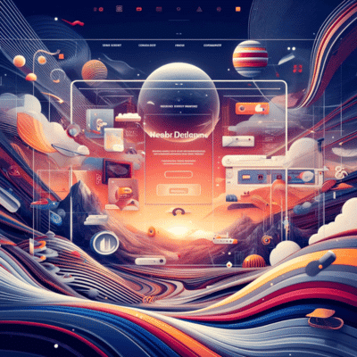
Parallax scrolling is a modern web design trend that creates an illusion of depth on web pages by making background images move slower than foreground elements as the user scrolls. This technique adds a dynamic and visually appealing layer to website design, enhancing user engagement by creating a more immersive browsing experience. By employing parallax scrolling, web designers can guide users through content in a way that feels interactive and captivating, making the site more memorable and enjoyable to navigate.
Implementing parallax scrolling effectively involves balancing movement and content to avoid overwhelming users. It’s crucial to ensure that the scrolling animations are smooth and that the parallax effects do not detract from the readability and accessibility of the website.
When used appropriately, parallax scrolling can highlight important information, create a sense of storytelling, and add a sophisticated touch to the overall design. This web design trend not only enhances visual appeal but also contributes to a more engaging and user-friendly experience.
Neumorphism: Blending Realism with Minimalism
Neumorphism, an emerging design trend, blends realism with minimalism to create visually striking interfaces that mimic physicality. This web design trend focuses on soft shadows, highlights, and subtle depth effects to make digital elements appear tangible. By incorporating design elements that simulate real-world objects, neumorphism offers a unique and engaging user experience. Web designers are leveraging this style to create aesthetically pleasing and intuitive interfaces that guide users seamlessly through web pages.
Despite its appeal, neumorphism has its challenges, particularly regarding accessibility. The reliance on low contrast and subtle shading can make it difficult for some users to navigate and interact with the website. Therefore, web design skills must balance aesthetic appeal with functionality, ensuring that interactive elements are both beautiful and user-friendly. As neumorphism continues to gain momentum, web designers must innovate to maintain the perfect blend of realism and minimalism while prioritizing user experience.
Voice-Activated Interfaces and Their Impact
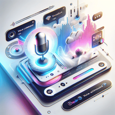
Voice-activated interfaces are revolutionizing the way users interact with web designs, offering a hands-free, intuitive experience. By utilizing voice commands, users can navigate web pages, perform searches, and access information quickly and efficiently. This technology enhances accessibility for those with disabilities, ensuring a more inclusive online environment. As design trends evolve, web designers are increasingly integrating voice-activated elements to meet the growing demand for seamless, user-friendly interfaces.
The impact of voice-activated interfaces extends beyond usability, influencing the overall website’s design. Web designers must consider the unique requirements of voice interactions, such as clear information hierarchy and optimized voice search capabilities. This shift also necessitates a focus on speed and performance, ensuring that web pages respond promptly to voice commands. As voice technology continues to advance, it will play a pivotal role in shaping the future of modern web design, offering innovative ways to enhance user engagement and satisfaction.
Enhancing User Experience with Dynamic Cursors
Dynamic cursors are an innovative tool in modern web design that significantly enhance user experience by adding interactivity and engagement. By changing the cursor’s appearance and behavior in response to user actions, dynamic cursors can guide users through web pages, provide visual feedback, and create a more immersive browsing experience. These interactive elements help capture users’ attention and make the navigation process more intuitive, contributing to a more visually appealing and visually interesting website’s design.
Integrating dynamic cursors requires careful consideration of the website design to ensure they complement other design elements. For instance, combining dynamic cursors with micro animations and animated elements can create seamless transitions and interactive feedback. This approach not only enhances the aesthetic appeal but also improves functionality, making it easier for users to interact with the web pages. As web designers continue to explore new ways to engage users, dynamic cursors will remain a valuable asset in creating visually striking and user-friendly web designs.
Trends in Grid and Asymmetrical Layouts
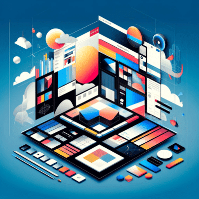
In the evolving landscape of web design trends, grid and asymmetrical layouts are gaining momentum as key styles for creating unique and engaging website design. Grid layouts offer a structured approach, using columns and rows to organize content, ensuring a clean and balanced aesthetic. This method enhances readability and allows for the effective presentation of design elements. Many web designers leverage grid layouts to create visually appealing and consistent designs that guide users seamlessly through web pages.
On the other hand, asymmetrical layouts break away from traditional grid constraints, offering a more dynamic and unpredictable approach to modern web design. These layouts create visual interest and highlight specific content areas by strategically placing elements in a non-linear fashion. Asymmetrical designs can effectively capture users’ attention and provide a visually striking experience, making them ideal for interactive websites looking to stand out. By combining both grid and asymmetrical layouts, web designers can create website designs that are both functional and creatively engaging.
Focus on User Experience and Interface Design
Incorporating the latest website design trends is essential for enhancing user experience and interface design. A user-centric approach ensures that visitors find the website intuitive and enjoyable to navigate. This involves utilizing modern design elements such as structured layouts, interactive features, and responsive design. By prioritizing these aspects, web designers can create websites that are not only visually appealing but also highly functional. Staying updated with current website design trends allows designers to implement innovative solutions that meet the evolving needs of users.
One of the key website design trends is the use of dynamic and interactive elements that respond to user behavior. This includes features like animated elements, micro animations, and dynamic cursors, which enhance the overall user experience by making interactions more engaging and intuitive. Integrating these trends helps guide users smoothly through the website, improving satisfaction and retention rates. Emphasizing user experience and interface design through the latest website design trends ensures that websites remain relevant, effective, and user-friendly.
Structured Typography for Better Readability
Structured typography is a critical aspect of modern website design trends, significantly impacting readability and user engagement. By choosing clean, legible fonts and organizing text hierarchically, web designers can enhance the overall clarity and visual appeal of a website. This approach not only makes the content more accessible but also helps guide users’ attention to key information. Incorporating structured typography aligns with the latest website design trends, ensuring that websites are both functional and aesthetically pleasing.
FAQ’s
What are the latest web design trends for 2024?
The latest web design trends for 2024 include dark mode, micro animations, and interactive elements that enhance user engagement and visual appeal.
How can design trends impact website performance?
Adopting modern design trends such as minimalism and responsive design can improve website performance by making pages load faster and enhancing user experience.
What is the importance of dark mode in web design trends?
Dark mode reduces eye strain, saves battery life on mobile devices, and creates a sleek, modern look that is popular among users.
How do micro animations fit into current web design trends?
Micro animations add subtle, engaging motion to web elements, making interactions smoother and more intuitive, which aligns with user-centric design trends.
Why is minimalism a significant design trend?
Minimalism enhances usability by reducing clutter, focusing on essential elements, and improving the overall aesthetic and readability of a website.
What role do interactive elements play in modern web design?
Interactive elements such as hover effects, clickable areas, and dynamic content increase user engagement and make the browsing experience more immersive.
How does dark mode improve user experience in web design?
Dark mode improves user experience by providing a comfortable viewing option in low-light conditions and highlighting key elements with higher contrast.
What are the benefits of using grid layouts in web design trends?
Grid layouts offer structure and organization, making content easier to navigate and enhancing the visual hierarchy of a website.
How do current design trends influence brand identity?
Incorporating contemporary design trends like custom illustrations and unique typography helps establish a distinct and recognizable brand identity.
What are some design trends that enhance mobile website performance?
Responsive design, simplified navigation, and optimized images are key trends that enhance mobile website performance, ensuring a seamless user experience across devices.









4 Comments
1) Parllax effect : It creates the illusion of depth by using layers, moving at different speeds.
2) 3d visual : With the spread of higher resolution screens, designer follow it by playing with 3d for animations and illustrations on websites.
3) Emojis : According to adobe more than 60 percent of people say emoji make conversations more fun and playful.
4) Minimalism : It may one day completely overtake complex designs, because minimalism helps user focus only the essentials
Thanks for the insight. Your comments are valuable to us.
Hi Thanks for sharing such an amazing information with us about web design. i hope you keep on share such kind of useful information with us.
thanks! glad you like it.