

Why you can trust Sunlight Media
- Expertise and Experience:Our content is crafted by seasoned professionals with extensive experience in digital marketing, ensuring you receive accurate and actionable advice.
- Unbiased Information:We provide impartial insights and recommendations based solely on what's best for your business, without any hidden agendas or promotions.
- Thorough Research:Our articles are backed by comprehensive research and the latest industry trends, ensuring you stay informed with reliable and up-to-date information.
- Transparency and Honesty:We believe in complete transparency. We disclose our sources, methodologies, and any potential conflicts of interest, so you can trust the integrity of our content.
- Continuous Improvement:We constantly review and update our content to reflect the latest developments in digital marketing, so you always have access to the most current and relevant information.
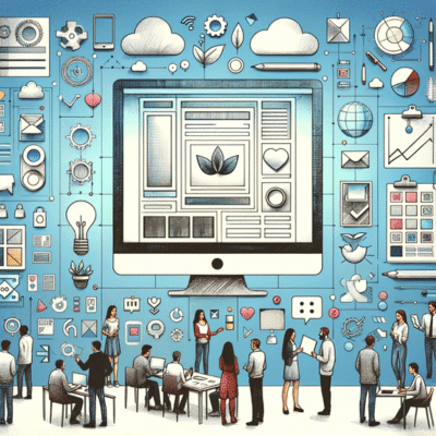
Ever wondered why some digital platforms are more engaging and easy to navigate than others? The secret lies in a carefully crafted user experience. A well-tailored user experience goes beyond aesthetics; it caters to users’ needs and preferences, guiding them through a seamless interaction journey. Now, let’s embark on the fascinating journey of understanding and implementing effective user experience tips for smoother digital interaction.
Key Takeaways
- Understand user behavior and create personas to gain insights into users’ needs.
- Leverage behavioral analytics tools, design for clarity, craft clear calls-to-action and optimize images/media for maximum usability.
- Incorporate interactive elements, utilize white space & color psychology to engage the user effectively.
1. Understanding User Behavior

An integral part of any successful user interface is understanding user behavior. Comprehending how users interact with a website’s UI elements is the first step towards creating a user-centric design. Ever wonder why some pages on a website are more visited than others? Or why users abandon their shopping carts halfway through the process? The answers to these questions lie in understanding user behavior.
Interacting with users, observing their behavior, and probing with relevant questions allows a web designer to gather useful insights. These insights pave the way for a UX design that aligns with user expectations.
The Role of User Research
A web designer, akin to a detective, uses user research to understand user needs, preferences, and challenges. Employing various strategies like surveys, interviews, and usability testing helps designers deeply comprehend user objectives, motivations, and behaviors. This understanding aids in creating a layout that aligns with user preferences.
Just like an artist has a palette of colors, a web designer’s palette is the rich insights gleaned from user research, which paints a clear picture of the user’s interaction with the website.
Crafting Effective Personas
User personas serve as a compass in the vast ocean of UI design. Think of them as user archetypes that guide design decisions, helping designers understand their target audience better. Crafting effective personas is like sculpting a statue; each detail matters and contributes to the final piece.
Understanding patterns and consolidating key data help to build realistic personas. These personas serve as a link between the user and the website, improving communication and enhancing usability.
Behavioral Analytics Tools
Much like a ship captain uses a compass to navigate, a web designer uses behavioral analytics tools to gain insights into user interactions with the website. These tools serve as a roadmap, illuminating the path users take when interacting with the website. The use of these tools enables designers to:
- Identify and address usability issues
- Refine designs
- Tailor user experiences
- Evaluate the effect of UI modifications
This ensures an optimal user experience.
2. Designing for Clarity
The path to a successful UI design is paved with clarity. Like a lighthouse guiding ships through the fog, clear calls-to-action, legible font sizes, and streamlined navigation paths guide users through a website, ensuring they can easily access the information they need. Skilled ui designers play a crucial role in creating such user-friendly user interfaces.
Designing for clarity allows web designers to build a user-friendly and easily navigable interface, thereby improving the user experience.
Crafting Clear Calls-to-Action
Imagine being in a bustling city without any signboards. Confusing, right? Calls-to-action serve as signboards, guiding users through a website. They need to be clear, compelling, and action-oriented, like a persuasive speech that compels the audience to take action.
The color and design of a call-to-action can significantly affect its efficacy, evoking an emotional response from users and influencing their willingness to take action.
Selecting Legible Font Sizes
The words on a website are like the lyrics of a song; they tell a story. And just as the melody carries the lyrics, the font size carries the words. Choosing a legible font size is like composing a harmonious melody; it should strike a balance between readability and aesthetics, thereby enhancing the overall user experience.
Remember, the recommended font size for paragraphs in a user interface is 16 pixels, ensuring optimal readability for all users.
Streamlining Navigation Paths
Navigating through a website should be as smooth as sailing on calm waters. Simplifying navigation paths is key to providing an effortless user experience. By utilizing:
- Clear and concise labeling
- Intuitive design
- Streamlined menu structures
- Consistency in format and design
A website can be transformed into a user-friendly platform, drawing users back like a compass points north.
3. Responsive Design Essentials
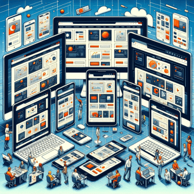
Change is inevitable in the digital world. There is nothing constant here apart from it. As users access websites on various devices, it’s crucial that the design is responsive, ensuring flexibility across screens and providing support for touchscreen devices. A responsive design is like a chameleon; it adjusts to its environment, providing a consistent user experience regardless of the device being used.
Flexibility Across Screens
In the era of smartphones, tablets, and mobile devices, designing for various screen sizes and orientations is no longer a luxury, but a necessity. A design needs to be as flexible as an acrobat, accommodating a variety of devices while ensuring a seamless user experience with mobile apps, including android app.
By utilizing responsive layout and considering the needs of users, a graphic design can truly shine, captivating users and leaving a lasting impression.
Touchscreen Considerations
Touch interactions and gestures are like the dance of fingers on a screen. Designing for touch requires a deep understanding of how users interact with touchscreens. By considering factors such as spacing, interactive elements, and feedback, designers can create an interface that is not only visually appealing but also intuitive and user-friendly, ensuring a smooth dance of interaction between the user and the website.
4. Enhancing Load Time Performance
Imagine waiting in a long queue only to be told that the wait is going to be longer. Frustrating, isn’t it? Similarly, long loading times can frustrate users and potentially lead them to abandon the website. Therefore, optimizing images and media and leveraging browser caching are key to enhancing load time performance and reducing cognitive load on users.
Improving load time performance not only elevates the user experience but also raises the chances of users remaining on your site.
Optimizing Images and Media
Images and media are like the cherries on top of a well-designed website. However, they are also the primary contributors to slow load times. It’s vital to strike a balance, ensuring that images and media enhance the user experience without compromising load time.
Compressing and optimizing images guarantees quicker load times without compromising your website’s visual appeal.
Leveraging Browser Caching
Browser caching is like a secret weapon that helps improve website performance. By storing certain website files locally, the browser can retrieve these files from its cache instead of downloading them again from the server, resulting in faster load times.
Leveraging browser caching reduces server load, enhances performance, and leads to a smoother user experience.
5. Simplifying User Input

Simplicity is the ultimate sophistication, even when it comes to user input. Efficient form design and clear error messages streamline user input, simplifying interactions with your website.
Remember, a good user experience is not just about what users see, but also about how they interact with your website.
Efficient Form Design
Filling out a form should be as straightforward as ABC. With clear labels, logical organization, and minimal input fields, form design can be made efficient and user-friendly.
Maintaining simplicity and intuitiveness in forms ensures a seamless user experience and elevates user satisfaction.
Error Message Clarity
Error messages should serve as helpful guides rather than roadblocks. By providing helpful and specific error messages, you can guide users through the correction process, reducing frustration and enhancing the overall user experience.
Remember, the goal is to help the user move forward, not to highlight their mistakes.
6. Visual Hierarchy and Attention Guides
Visual hierarchy and attention guides are like the stars in the sky, guiding the user’s gaze and helping them navigate through the website. Establishing a visual hierarchy and attention guides prioritizes content and maintains consistent UI patterns for a seamless and intuitive user experience.
Prioritizing Content with Visual Cues
Visual cues serve as spotlights, highlighting the most important elements on a page. By providing a visual cue, these guides direct users’ attention to key content, ensuring that vital information doesn’t go unnoticed.
It’s like a tour guide pointing out the highlights of a tour, ensuring that tourists don’t miss any important sights.
Consistent UI Patterns
Consistency in UI patterns is like the rhythm in a song, creating a cohesive and harmonious user experience. To maintain consistency in UI elements and patterns creates a seamless and intuitive user interface, facilitating easy navigation and interaction for users.
7. Empowering Users with Search Capabilities

Empowering users with search capabilities is like handing them a map, enabling them to easily find relevant content. By incorporating a user-friendly search function and optimizing the search algorithm, you can ensure that users can swiftly find the information they seek, enhancing their overall experience.
8. Accessibility in Design
Designing with accessibility in mind is like opening a door to all, ensuring that everyone, including users with disabilities, can have a seamless experience. By considering the needs of users with various disabilities, you can create a universal design that is inclusive and user-friendly, enhancing the overall user experience. Accessibility plugins can be invaluable tools in this process, offering features like screen reader support, keyboard navigation, and color contrast adjustments. To find the best accessibility plugin, explore options within your platform’s plugin marketplace, where you can read reviews and compare features to suit your specific needs.
9. Balancing Aesthetics with Functionality
In the world of web design trends, aesthetics and functionality are like two sides of the same coin. While aesthetics attract users, functionality keeps them engaged. Striking the right balance between the two is crucial for creating visually appealing and usable interfaces.
After all, a website should not only look good but also function well.
10. Iterative Design and User Feedback
Iterative design and user feedback are like the two wheels of a bicycle, propelling the design process forward. Incorporation of user feedback into the iterative design process refines and enhances the user experience, ensuring the final product aligns with user needs and expectations.
Prototyping and Testing
Prototyping and testing are like rehearsals before a play, identifying areas for improvement before the final performance. Prototyping and testing designs identify any usability problems, functionality issues, or performance gaps, guaranteeing a seamless user experience in the final product.
Incorporating User Feedback
Incorporating user feedback into the design process is like adding spices to a dish – it enhances the flavor by adding depth and complexity. Incorporating user feedback enables informed design decisions that align with user needs and expectations, resulting in a more engaging and satisfying user experience.
11. Interactive Elements That Engage

Interactive elements, like interface elements, are the sparkles on a firework display, captivating the user’s attention and encouraging interaction. By designing engaging interactive elements, you can create a dynamic and engaging user experience that leaves a lasting impression on users. Incorporating key elements, such as interface elements, ensures a successful and captivating design.
12. Navigational Signposts for Easy Orientation
Navigational signposts in a website are like road signs in a city, guiding users to their destination. By providing navigational signposts, you can ensure easy orientation and navigation, enabling users to easily find their way around your website.
13. Content Presentation for Maximum Impact
Presenting content for maximum impact is like arranging furniture in a room, ensuring it is visually impactful and organized. By strategically placing content and organizing it in a logical and intuitive manner, you can maximize its impact, ensuring that users can easily find and understand the information they need.
14. The Power of White Space
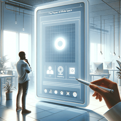
White space in design is like the silence in music, creating a sense of harmony and balance. By effectively utilizing white space, you can create a clean, uncluttered design that enhances readability and draws attention to the most important elements on the page.
15. Utilizing Color Psychology
Colors are like the notes in a song, evoking emotions and guiding user behavior. By leveraging color psychology, you can create a visually appealing and intuitive user interface that resonates with users and encourages them to interact with your website.
Summary
In the realm of digital interaction, a well-crafted user experience can make all the difference. By understanding user behavior, designing for clarity, implementing responsive design, enhancing load time performance, simplifying user input, and incorporating user feedback, we can create visually appealing and usable interfaces that attract and engage users. Let’s continue to leverage these proven user experience tips to create smoother and more engaging digital interactions.
Frequently Asked Questions
What are the 5 elements of user experience?
The five elements of user experience are strategy, scope, structure, skeleton and surface – a common framework used by UX designers to create successful designs. Each layer is built upon the one below it, resulting in an effective and well-crafted user experience.
What are the 5 steps of user experience?
The User Experience (UX) Design Process consists of 5 steps: Research, Information Architecture, Interaction Design, Prototyping and Testing, and Visual Design. Each of these steps work together to create a successful UX design.
What are the 4 golden rules of UI design?
The four golden rules of UI design are: placing the user in control, making interactions comfortable, reducing cognitive load, and creating consistency.
Why is understanding user behavior important in UI design?
Understanding user behavior is key to designing a successful user interface, as it allows UI designers to craft a design tailored to the users’ needs and preferences.
What is the role of user research in UI design?
User research is essential to UI design, as it gives designers key insights into user needs, preferences, and behavior to create an effective, user-centric product.


5 Comments
Nice post. Online food delivery app helps restaurant business to grow and makes the process easy for customers to order food online.
Thanks Niharika. Yes indeed. App development is a critical component to business marketing in general.
كل الشكر لك سيد انجيلو
This post is related with what I’m concerned with and it’s fantastically made. Thanks very much for your hardworking.
Thanks for your feedback. We’re glad to hear you found the information you’re looking for.