
Why you can trust Sunlight Media
- Expertise and Experience:Our content is crafted by seasoned professionals with extensive experience in digital marketing, ensuring you receive accurate and actionable advice.
- Unbiased Information:We provide impartial insights and recommendations based solely on what's best for your business, without any hidden agendas or promotions.
- Thorough Research:Our articles are backed by comprehensive research and the latest industry trends, ensuring you stay informed with reliable and up-to-date information.
- Transparency and Honesty:We believe in complete transparency. We disclose our sources, methodologies, and any potential conflicts of interest, so you can trust the integrity of our content.
- Continuous Improvement:We constantly review and update our content to reflect the latest developments in digital marketing, so you always have access to the most current and relevant information.
Did you know that a high bounce rate can negatively impact your website’s performance and search engine rankings? But don’t worry! In this blog post, we will guide you through understanding what bounce rate is, how it’s influenced, and “what is a good bounce rate” for your specific niche. We will also explore various strategies and real-life examples to help you improve your website’s bounce rate and boost your online presence.
Key Takeaways
- Understanding bounce rate involves using analytics and implementing strategies to reduce it.
- Factors such as design, content quality, page load time and mobile optimization affect the bounce rate of a website.
- Strategies like optimizing content for search intent, leveraging internal links and utilizing visuals can help improve user engagement & reduce bounce rates.
Understanding Bounce Rate
Bounce rate is a vital metric that gauges user engagement on your website. Understanding what’s a good bounce rate and aiming for a healthy bounce rate can significantly impact your site’s success. The number of visitors who leave your site after viewing only one page can be calculated. Divide this number by the total number of visitors accessing your site to get the result, which represents the page’s bounce rate.
A suitable website’s bounce rate to aim for is below 50%, while a bounce rate of 40% or lower is deemed ideal. High bounce rates may indicate that your website’s content or design isn’t meeting user expectations, leading to poor user experience.
Evaluating your website’s bounce rate using tools like Google Analytics is beneficial, offering valuable insights into user engagement and satisfaction. By identifying areas of improvement, you can implement various strategies to reduce your bounce rate and achieve a healthy bounce rate, such as:
- Enhancing site navigation
- Optimizing content for search intent
- Leveraging internal links
- Visually engaging visitors with multimedia
Factors Influencing Bounce Rate
Several factors may influence your website’s bounce rate, such as design, content quality, page load time, and mobile optimization, all of which contribute to overall site performance.
Each of these factors and their impact on bounce rate will be further explored in the following subsections.
Website Design and User Experience
A reduction in bounce rate often follows an appealing and user-friendly landing page design. Employing tools like scroll maps and click maps can help you identify areas of improvement and ensure that key elements like call-to-action buttons are immediately visible on both desktop and mobile devices. A well-designed 404 page can also guide users to the content they are seeking and direct them to alternate webpages, reducing bounce rates.
A superior website design should be intuitive, functional, and aesthetically pleasing. Tools like Microsoft Clarity and Hotjar Heatmaps can provide insights into customer behavior and help you optimize your website’s design and user experience, ultimately leading to a lower bounce rate.
Content Quality and Relevance
Retaining visitors and reducing bounce rates are often the result of high-quality, relevant content. Creating content that aligns with user search intent and meets their expectations is, therefore, necessary. Regular content updates can provide users with a wide range of topics to explore, encouraging them to visit and stay on your website. Precise page titles and meta descriptions can also help reduce bounce rates by increasing the likelihood that users will remain engaged on the page.
Establishing credibility and trust with your website visitors can further help reduce bounce rates. You can achieve this by displaying positive reviews, special seals, and ensuring the security of your site. SERP analysis can also be useful in determining the content that Google has identified as relevant to user keywords and help you create superior content that satisfies search intent, leading to lower bounce rates.
Page Load Time
Improving user experience and reducing bounce rates are often achieved through faster page load times. A recommended page load time to minimize bounce rate is around 2-3 seconds. You can optimize your page load time by using tools like Semrush’s Site Audit tool to analyze your website’s speed metrics.
Optimizing images, minifying CSS and JavaScript files, leveraging caching technologies, and compressing files can significantly reduce page load time. Making these changes can also improve the overall user experience.
Improving page load speed can lead to:
- A better user experience
- Increased customer satisfaction
- Higher conversion rates
- Ultimately reducing your website’s bounce rate.
Mobile Optimization
Given that mobile traffic accounted for nearly 60% of all web traffic worldwide as of 2023, reducing bounce rates often requires mobile optimization. A mobile-optimized website can enhance user experience and keep visitors engaged on your site. If your website isn’t mobile-friendly, you can use Google’s Mobile Friendly Test to identify the cause and make necessary adjustments.
Optimizing your website for mobile devices involves utilizing responsive design, larger buttons for easy clicking, and configuring input fields on forms to trigger the correct keyboard for easier input. Mobile optimization can positively impact your website’s SEO ranking, leading to improved search rankings, increased organic traffic, and higher user engagement.
Industry Benchmarks for Bounce Rates

Industry benchmarks can help you determine what a good bounce rate is for your specific niche or market, especially when considering mobile users. For example, the average bounce rate for eCommerce sites is around 47%, but this may vary depending on the industry, channel, device, and the behavior of mobile users.
Unfortunately, there is no available data on the bounce rate for blogs and informational websites, where visitors might stay on the same page without interacting with an internal link. You can use Google Analytics Benchmarking feature to compare your website data, including data from mobile users and interactions with internal links, to other companies in your industry and identify areas for improvement. By understanding industry benchmarks and the behavior of users on the same page, you can set realistic goals for your website’s bounce rate and develop strategies to achieve them.
Analyzing Bounce Rate with Google Analytics

Google Analytics is a powerful tool that can help you analyze your website’s bounce rate and identify areas for improvement. Bounce rate is defined by the platform as a single page session on your website in which the user opens a single page and exits without making any other requests to the Analytics server. By monitoring your website’s bounce rate, you can gain valuable insights into user engagement and satisfaction, helping you make data-driven decisions to optimize your website.
In addition to monitoring bounce rate, Google Analytics also provides other useful metrics like engaged sessions, exit rate, and page load time, which can help you identify trends and patterns in user behavior. By analyzing these metrics, you can develop targeted strategies to improve user experience and reduce bounce rates on your website.
Strategies to Improve Bounce Rate

After exploring the factors influencing bounce rate and how to analyze it, we will now discuss some effective strategies to improve your website’s bounce rate.
These strategies include enhancing site navigation, optimizing content for search intent, leveraging internal links, utilizing visuals and multimedia, and implementing A/B testing.
Enhancing Site Navigation
Improving site navigation can facilitate users in finding what they are searching for, which may result in a decreased bounce rate. By organizing your website’s navigation in a clear and straightforward manner, you can prevent visitors from becoming frustrated and leaving your site. Incorporating site search functionality can also help users find the content they’re looking for, further reducing your website’s bounce rate.
In addition to making navigation more user-friendly, you can use exit-intent popups to encourage visitors to stay on your site. Exit-intent popups can offer discounts, downloadable resources, or newsletter sign-ups when a user shows signs of leaving your website. This strategy has been shown to reduce bounce rates by as much as 60% in some cases.
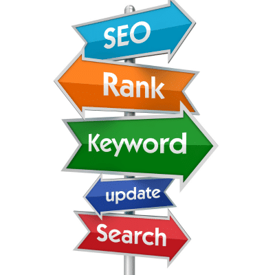
Optimizing Content for Search Intent
Creating content that meets the needs and expectations of your target audience is a key step towards satisfying search intent and reducing bounce rates. This involves understanding the different types of search intents, such as informational, navigational, commercial, and transactional, and creating content that addresses each of these intents in order to satisfy search intent.
One way to optimize content for search intent is by conducting SERP analysis. This allows you to understand the content that Google has identified as relevant to user keywords and create superior content that satisfies search intent. By aligning your content with user expectations, you can ensure that visitors stay engaged on your website, ultimately reducing bounce rates.
Leveraging Internal Links
Internal links can effectively engage visitors and prompt them to explore further content on your website, reducing bounce rates. By strategically placing internal links within your content, you can guide users to other pages relevant to their interests, encouraging them to stay on your site longer and explore multiple pages.
In addition to improving user engagement, internal links also play a vital role in SEO success. They assist Google in discovering and understanding all of the pages on your website, helping it determine which pages are most relevant. By incorporating relevant internal links, you can not only improve user experience but also boost your website’s search engine rankings.
Utilizing Visuals and Multimedia
Captivating visuals and multimedia content can significantly impact user engagement and help reduce bounce rates. By incorporating the following elements, you can capture site visitors’ attention and encourage them to stay on your site for longer periods:
- Videos
- Images
- Infographics
- Interactive content
Research has shown that video content can help decrease bounce rates and increase user engagement. Video blogs, for example, have been found to have an average 34% lower bounce rate than the rest of the site. By utilizing a variety of multimedia content, you can create a more engaging and immersive experience for your website visitors, ultimately reducing bounce rates.
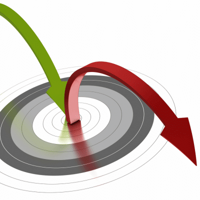
Implementing A/B Testing
A/B testing, which allows for comparison between two versions of a webpage to measure their impact on bounce rates, is an effective method for reducing these rates. By identifying elements like design, layout, and content that may be causing high bounce rates, you can make informed decisions to optimize your website and improve user engagement.
Some examples of A/B testing include comparing different call-to-action buttons, page layouts, or content formats. By analyzing the performance of each version, you can identify the most effective elements and strategies for reducing bounce rates on your website.
A/B testing provides valuable insights into the changes that can be made to improve user engagement and increase the amount of time visitors spend on your website, ultimately leading to a reduction in bounce rates.
Real-Life Examples of Improved Bounce Rates

Several companies have successfully improved their bounce rates by implementing various strategies, such as:
- Developing content in a logical sequence
- Optimizing user experience
- Strategically placing ads
- Making design modifications
Some businesses have focused on the following strategies to improve their website performance:
- Enhancing content quality and relevance
- Incorporating responsive design
- Improving page load speed to reduce bounce rates
- Optimizing their website for mobile devices, ensuring easy navigation and fast loading times for a better user experience.
By learning from these real-life examples and implementing similar strategies, you can improve your website’s bounce rate and boost your online presence.
Summary
In conclusion, understanding and improving your website’s bounce rate is crucial for enhancing user engagement, satisfaction, and search engine rankings. By focusing on factors such as website design, content quality, page load time, and mobile optimization, and implementing strategies like enhancing site navigation, optimizing content for search intent, leveraging internal links, and utilizing visuals and multimedia, you can effectively reduce your bounce rate and boost your website’s performance. Remember, a lower bounce rate can lead to increased conversions and a more successful online presence.
Frequently Asked Questions
Is 20% bounce rate good?
20% bounce rate is an excellent result that’s significantly better than the ideal benchmark of 26-40%. This indicates a high level of user engagement and suggests that your website is functioning well.
Is 75% a high bounce rate?
A bounce rate of 75% is generally considered high, unless there is a very good reason for it. It may be cause for concern if your goal is to maximize website engagement.
How do I lower my bounce rate?
Reduce your bounce rate by focusing on improving user experience, making your site mobile-friendly and easy to navigate, displaying clear calls to action, optimizing page load time, using shorter paragraphs and various types of content, and implementing exit-intent popups.
How can website design influence bounce rate?
Good website design can help reduce bounce rate by providing an easy-to-use interface and keeping visitors engaged with content. Poor design can lead to users leaving the site quickly, resulting in a higher bounce rate.
What is the difference between bounce rate and exit rate?
Bounce rate measures the percentage of visitors who leave your website after viewing only one page, while exit rate is the percentage of visitors who leave from a specific page. Therefore, bounce rate gives an indication of user engagement, while exit rate reveals which page users are exiting from.


One Comment
Excellent post. I absolutely love this site.thanks