

Why you can trust Sunlight Media
- Expertise and Experience:Our content is crafted by seasoned professionals with extensive experience in digital marketing, ensuring you receive accurate and actionable advice.
- Unbiased Information:We provide impartial insights and recommendations based solely on what's best for your business, without any hidden agendas or promotions.
- Thorough Research:Our articles are backed by comprehensive research and the latest industry trends, ensuring you stay informed with reliable and up-to-date information.
- Transparency and Honesty:We believe in complete transparency. We disclose our sources, methodologies, and any potential conflicts of interest, so you can trust the integrity of our content.
- Continuous Improvement:We constantly review and update our content to reflect the latest developments in digital marketing, so you always have access to the most current and relevant information.
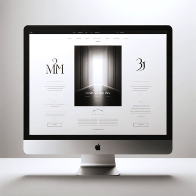
In the realm of digital aesthetics, minimalist web design stands as a beacon of simplicity and elegance. This design philosophy, emphasizing a “less is more” approach, strips down websites to their essential elements, prioritizing content clarity and user experience. At its core, minimalist web design harmonizes bold typography, a limited color palette, and ample use of negative space to create visually captivating websites that are both functional and beautiful. By focusing on minimalist websites, designers leverage design elements like sans serif fonts and subtle animations to draw attention to the main focus, ensuring that every pixel serves a purpose. This approach not only enhances the visual appeal of a website but also supports better navigation and responsiveness across different screen sizes. In crafting minimalist website designs, the goal is to remove visual clutter, emphasize simplicity, and create engaging experiences that leave a lasting impression at first glance. Through the careful application of minimalist design principles, web designers and developers can create websites that embody the minimalist aesthetic, offering users a clean, efficient, and visually appealing digital space.
Introduction to Minimalist Web Design: Embracing Simplicity

Minimalist web design marks a deliberate departure from complexity towards a philosophy of embracing simplicity. This approach to web design is grounded in the belief that less is more, focusing on the essentials to achieve clarity and functionality. By eliminating unnecessary elements, minimalist web design aims to enhance user engagement through a clean, uncluttered interface. The use of bold typography, a restrained color palette, and ample white space are hallmark features that define this aesthetic. These design choices not only contribute to a visually appealing layout but also improve site usability and accessibility. In embracing simplicity, minimalist web design underscores the importance of content and user experience, ensuring that every design element serves a specific purpose. This introductory principle sets the foundation for creating websites that are not just visually striking but also highly functional and user-centric.
The Essence of Minimalist Website Design: Principles and Practices
The essence of minimalist website design lies in its adherence to a set of core principles and practices that prioritize simplicity, functionality, and elegance. At the heart of minimalist design is the principle of reduction—stripping away the non-essential elements to focus on what is truly important. This practice involves employing a minimal color palette, often monochromatic or with limited colors, to avoid visual overwhelm and direct attention to the content. Typography also plays a critical role, with bold and clean sans serif fonts providing clear readability and contributing to the overall minimalist aesthetic. Achieving this refined design approach requires the expertise of professional web development services, which ensure that minimalist principles are meticulously implemented while maintaining optimal functionality and a seamless user experience.
Another fundamental practice is the strategic use of negative space, or white space, which gives the website’s content room to breathe and creates a sense of balance and harmony. This ample use of empty space is not just a stylistic choice but a functional one, enhancing user navigation by making the site’s structure intuitively understandable.
Minimalist website design also emphasizes the importance of visual hierarchy, using size, color, and layout to guide the viewer’s attention to the most critical parts of the site. Subtle animations and interactive elements may be used sparingly to add interest and engagement without detracting from the minimalist ethos.
In practice, these principles come together to create websites that are not only aesthetically pleasing but also highly user-friendly. By focusing on simplicity and the essentials, minimalist website design ensures that users have a seamless and engaging experience, free from the distractions of excessive decoration or complexity.
Minimalist Design Principles: Guidelines for Simplified Visuals
Minimalist design principles revolve around guidelines that champion simplified visuals and a focus on functionality. These principles dictate the use of a limited color palette to create a cohesive aesthetic, often leaning towards monochromatic color schemes that evoke a sense of calm and order. Essential elements such as ample negative space are pivotal, allowing the design to breathe and enhancing the focus on the content. In minimalist website design, every component from typography to navigation bar is meticulously chosen to emphasize simplicity, ensuring that the overall design is not just visually appealing but also user-friendly. Emphasizing simplicity extends to the choice of images, where large images and a white background can be employed to draw attention to the main focus, steering clear of visual clutter. Furthermore, minimalist designs often incorporate a clear sense of hierarchy, making use of various elements like bold typography and subtle animations to guide the user’s journey through the site. By adhering to these minimalist design principles, creators are able to forge engaging experiences that are both aesthetically pleasing and highly functional, embodying the minimalist approach in every aspect of the site design.
Color Palette Considerations in Minimalist Website Design
In the realm of minimalist website design, color palette considerations play a crucial role in defining the visual appeal and mood of a site. Adhering to minimalist design principles, designers often opt for a limited color palette, sometimes embracing a monochromatic color scheme, to create a clean, cohesive look that emphasizes simplicity and sophistication. This approach not only helps in maintaining a minimalist aesthetic but also in drawing attention to the main focus without the distraction of multiple colors. The use of ample negative space, paired with these carefully selected colors, contributes to a visually captivating experience, where elements such as navigation bars and large images stand out more effectively against a minimalist backdrop, such as a white background. By focusing on simplicity in color choices, minimalist web designers ensure that the site remains visually appealing and engaging, making every color used purposeful and impactful in the overall design.
Design Elements that Define Minimalist Web Design
Design elements that define minimalist web design hinge on the principle of stripping down to the essentials to create a visually clean and functionally focused user experience. Key to this approach is the meticulous selection of design features, such as a limited color palette and the strategic use of ample negative space, which together create a serene and uncluttered visual landscape. Emphasizing simplicity, these elements include bold typography and large images set against a white background, guiding the user’s attention directly to the content without unnecessary distractions. The navigation bar is simplified, enhancing user-friendly navigation and ensuring that the site’s design remains intuitive across various devices. By incorporating these essential elements in a minimalist design, web designers craft spaces that not only embody the minimalist aesthetic but also improve usability, making the website engaging and accessible to all visitors.
Bold Typography in Minimalist Design: Enhancing Visual Hierarchy
Bold typography plays a pivotal role in minimalist design, serving as a crucial tool for enhancing visual hierarchy and guiding the viewer’s attention within a minimalist website. By employing clean, sans serif fonts against a backdrop of ample negative space, designers can create a stark contrast that elevates key messages and headings, making them immediately noticeable upon first glance. This deliberate use of typography not only emphasizes simplicity and clarity but also injects a strong sense of style and personality into the overall design. In minimalist web design, where elements are reduced to their most essential form, the strategic use of bold typography alongside a limited color palette and large images against a white background ensures that the main focus remains on the content, facilitating a clear and direct communication pathway with the audience. Through this careful consideration of typography within the minimalist framework, designers craft visually captivating experiences that are both aesthetically pleasing and highly functional.
Sans Serif Fonts: The Choice for Clean, Minimalist Websites
Sans serif fonts are the hallmark of clean, minimalist website design, offering a sleek and modern aesthetic that enhances readability and sharpens the overall visual appeal. These fonts, devoid of the small projecting features called “serifs” at the end of strokes, embody the minimalist design principle of simplicity, making them a perfect choice for minimalist websites. Their crisp, uncluttered appearance not only complements a minimal website design but also ensures that page links and navigation bars are easily legible across various screen sizes. This typographic style is especially effective against a white or black background, where the contrast further amplifies clarity and directs the viewer’s focus to the main content. By choosing sans serif fonts, web designers embrace a minimalist approach that emphasizes content over form, delivering an engaging experience to users with a clear sense of modernity and sophistication.
The Role of Graphic Design in Crafting Minimalist Websites
Graphic design plays a pivotal role in crafting minimalist websites, where the emphasis on simplicity and functionality guides the visual and interactive experience. Through the careful selection of elements such as a limited color palette and ample white space, graphic designers create visually captivating spaces that emphasize content and improve usability. The strategic use of design principles, including the balance between empty space and content, allows for a clear sense of hierarchy and focus. In minimalist web design, every visual element from typography to imagery is meticulously chosen to support the overall aesthetic and purpose of the site. This approach ensures that the website not only looks modern and sleek but also offers an intuitive and user-friendly navigation experience. By leveraging the principles of graphic design, designers are able to distill complex ideas into simple, engaging, and effective minimalist site designs that stand out in the digital landscape.
The Minimalist Aesthetic: Creating Visually Captivating Websites
The minimalist aesthetic is central to creating visually captivating websites, focusing on the essence of simplicity and elegance in web design. By employing a limited color palette and embracing ample white space, designers craft an environment that highlights the core content without overwhelming the user with excessive details. This aesthetic choice not only ensures that the website remains engaging and easy to navigate but also reinforces the importance of functionality and user experience. In minimalist design, the deliberate absence of superfluous elements and the emphasis on clean lines and typography foster a sense of clarity and sophistication. The use of a monochromatic color scheme and subtle animations adds depth and interest, guiding the user’s attention to the most vital information. Through these principles, the minimalist aesthetic achieves a balance between beauty and utility, creating websites that are not only visually appealing but also profoundly impactful.
Embracing Negative Space: The Core of Minimalist Web Layouts
Embracing negative space is fundamental to the core of minimalist web layouts, serving as a powerful tool to create a clean, focused, and user-friendly interface. This design strategy involves intentionally leaving parts of the layout empty, which paradoxically enhances the visibility and impact of the content that is present. By prioritizing negative space, designers can draw attention to key elements such as navigation bars and page links, making them more accessible and intuitive for users. The strategic use of empty space around text and images also improves readability and reduces visual clutter, allowing the website’s main message to stand out with greater clarity. In minimalist website design, the adept use of negative space embodies the minimalist approach, emphasizing simplicity and functionality. It encourages users to focus on what truly matters, making websites not just aesthetically pleasing but also more effective in communicating their core message.
Ample White Space: Breathing Room for Your Content
Ample white space, often regarded as the breathing room for content, is a key element in minimalist web design that enhances readability and focus. By incorporating generous amounts of white space around text blocks, images, and other website elements, designers can create a clean, uncluttered layout that emphasizes the importance of each piece of content. This approach not only improves user experience by making navigation more intuitive but also contributes to a visually appealing aesthetic that draws attention to the main focus of the page. The effective use of white space supports a minimalist aesthetic by providing a calm and serene backdrop against which the content can stand out, making the website not just a source of information but also a visually captivating experience. In the context of minimalist design, ample white space is more than just empty space; it’s a strategic design choice that highlights the website’s most important elements, ensuring they are engaging and accessible to users.
Simplistic Design and Essential Elements: Stripping Down to Basics

Simplistic design and essential elements lie at the heart of stripping down to basics in minimalist web design, where the goal is to focus on what is truly necessary for effective communication and user experience. By embracing a minimal design style, web designers are able to highlight the core message and functionality of the website, ensuring that every element serves a purpose. This approach often involves the use of a limited color palette and ample white space, creating a clean and uncluttered interface that is visually appealing and easy to navigate. Essential elements such as straightforward navigation bars and clear, concise typography are prioritized over decorative additions, emphasizing content over form. The result is a website that embodies the principles of simplicity and minimalism, offering users an engaging experience that is both intuitive and aesthetically pleasing. Through the deliberate choice of simple website designs and essential elements, designers craft spaces that are both functional and beautiful, showcasing the power of minimalism in web design.
Visual Clutter vs. Minimalist Design: Achieving the Perfect Balance
Achieving the perfect balance between visual clutter and minimalist design involves a deliberate and thoughtful reduction of non-essential elements to enhance the user’s focus and engagement. By embracing a minimalist design approach, web creators strip away the superfluous, allowing the essential elements of a website to shine through. This practice not only simplifies the user interface but also elevates the overall user experience by reducing visual clutter. Through the strategic use of a limited color palette, ample white space, and clean typography, designers can create a visually captivating experience that draws attention to the main content without overwhelming the viewer. The challenge lies in maintaining enough visual interest to engage users while ensuring the design remains accessible and easy to navigate. By focusing on simplicity, functionality, and essential elements, designers can craft minimalist websites that achieve a harmonious balance, offering users an uncluttered and engaging digital environment.
Engaging Users with Subtle Animations and Minimalist Interactivity
Engaging users with subtle animations and minimalist interactivity offers a refined way to enhance the user experience without detracting from the minimalist design ethos. In a landscape where simplicity and functionality reign supreme, the incorporation of gentle animations and interactive elements can breathe life into minimalist websites. These design techniques, when used sparingly, serve not only to attract attention in a non-intrusive manner but also to guide users through the website with intuitive ease. By integrating subtle animations, designers can create a sense of dynamism and fluidity, making navigation more engaging and informative. Minimalist interactivity, such as hover effects on navigation bars or buttons, adds an interactive layer that encourages user exploration while maintaining the overall minimalist aesthetic. This approach ensures that the website remains visually appealing and user-friendly, providing an inviting and memorable experience that subtly draws users deeper into the content.
User-Friendly Navigation in Minimalist Site Designs

In the realm of minimal web design, user-friendly navigation emerges as a cornerstone, ensuring that simplicity in design does not compromise the ease of user interaction. Design examples from leading design agencies frequently showcase how minimalist site designs can effectively utilize clean lines, straightforward layouts, and intuitive navigation systems. These agencies understand that the essence of minimalism lies not just in aesthetic appeal but also in functionality, where every element serves a purpose. By stripping down to the basics, they create navigation experiences that are both visually appealing and remarkably user-friendly. This approach not only adheres to the principles of minimal web design but also sets a benchmark for how minimalist design can enhance user satisfaction. Through careful planning and execution, design agencies prove that minimalism, when correctly applied, can lead to sophisticated and efficient website navigation systems that cater to the needs of today’s fast-paced digital world.
Minimalist Website Design Trends: What’s Next?
Looking ahead, the future of minimalist website design is poised for innovative shifts, as designers from a top design agency draw inspiration from the best websites to set new benchmarks in simplicity and user experience. An excellent example of this evolution is the increasing integration of dynamic elements such as subtle animations, which add depth to the minimalist aesthetic without compromising its core principles. The trend towards more personalized experiences is also gaining momentum, with designers leveraging data to tailor content, making each user’s journey unique. This could mean the introduction of features that adapt the homepage or navigation based on user behavior, making for an engaging experience that feels both intuitive and bespoke. Additionally, the exploration of new typographies, like black typography, and the clever use of white background to highlight content, are trends that continue to push the boundaries of minimalist design. These innovations signify a move towards designs that are not only visually striking and easy to navigate but also deeply resonant with users on a personal level, marking an exciting new chapter in the minimalist design narrative.