
Why you can trust Sunlight Media
- Expertise and Experience:Our content is crafted by seasoned professionals with extensive experience in digital marketing, ensuring you receive accurate and actionable advice.
- Unbiased Information:We provide impartial insights and recommendations based solely on what's best for your business, without any hidden agendas or promotions.
- Thorough Research:Our articles are backed by comprehensive research and the latest industry trends, ensuring you stay informed with reliable and up-to-date information.
- Transparency and Honesty:We believe in complete transparency. We disclose our sources, methodologies, and any potential conflicts of interest, so you can trust the integrity of our content.
- Continuous Improvement:We constantly review and update our content to reflect the latest developments in digital marketing, so you always have access to the most current and relevant information.
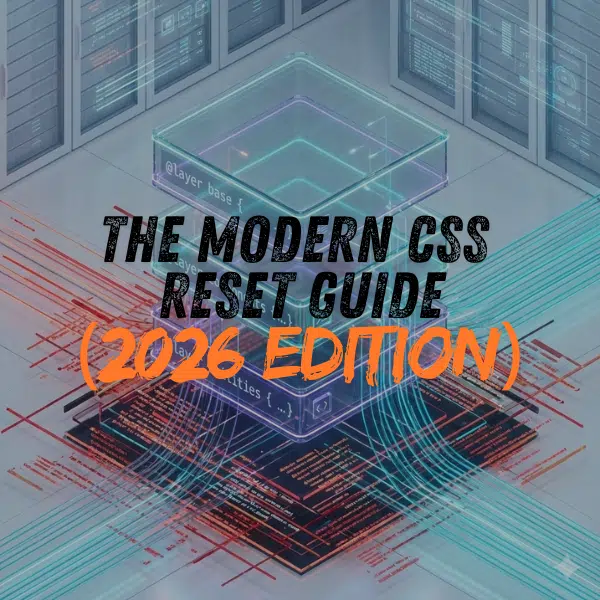
Modern CSS architecture utilizes Cascade Layers to establish consistent global baselines without the specificity conflicts of legacy reset methods.
Key takeaways
- Cascade layers (@layer) prevent specificity wars between defaults and components.
- Modern baselines build upon consistent browser standards rather than stripping them.
- Legacy destructive resets often break native accessibility features like focus rings.
Updated: January 19, 2026
Web development has shifted from aggressive style removal to strategic layering. Early developers used “destructive” resets that forced all margins to zero. This approach often removed critical accessibility features. The industry later adopted normalization to correct browser inconsistencies. In 2026, the standard is the Cascade Layer. Sunlight Media implements this Web Design Service strategy to prioritize application styles over defaults automatically. This architectural shift ensures that global baselines never interfere with complex components.
The introduction of @layer allows developers to define a “reset” layer with low priority. Browsers apply these styles first, but they yield immediately to any specific design tokens. This eliminates the need for !important tags to override base styles. You can view examples of this clean architecture in our project portfolio.
Why “Resetting” is the Wrong Mental Model in 2026
The term “reset” incorrectly implies that a browser should have no default styles. Browsers provide a User Agent stylesheet that ensures content remains readable and accessible by default. A blank slate often harms the user experience. Modern strategies focus on “intelligent baselines” that preserve helpful defaults. For example, the Interop 2026 initiative ensures that form controls and typography render consistently across engines. Developers should add useful defaults rather than subtracting browser opinions.
Attempting to strip all styles creates unnecessary work. It forces developers to re-declare standard behaviors like bold headers or list bullets. A modern baseline accepts the browser’s foundation and only bridges the gap to the specific design system. This approach respects the platform and reduces code complexity.
Implementing Cascade Layers (@layer) for Conflict-Free CSS
 Developers previously managed CSS conflicts by increasing selector weight. This practice resulted in complex code and frequent use of the
 !important tag. Modern browsers now support the @layer at-rule. This feature groups styles into named buckets like “reset,” “base,” and “components.” The browser applies these styles based on the defined layer order rather than the specific class names. Sunlight Media uses this modular approach in our Web Design Services to build scalable stylesheets. This method ensures that third-party widgets never break a site’s core layout.
Tailwind CSS v4 demonstrates this architecture perfectly. It imports its reset using @import "tailwindcss/preflight" layer(base);. This places all default styles into a low-priority layer. Developers can then override these defaults easily in their own code. You can see examples of this conflict-free architecture in our mobile app case studies.
Solving the Specificity Wars with Layer Ordering
Specificity wars occur when two CSS rules compete for the same element. In the past, a rule with an ID selector always defeated a class selector. Layer ordering changes this logic. A rule in a higher-priority layer defeats any rule in a lower layer, regardless of specificity. For example, a simple class in the “components” layer will override an ID in the “reset” layer.
Developers define the layer order at the top of the CSS file. A common declaration looks like @layer reset, base, theme, utilities;. The browser prioritizes the last layer in the list. This system guarantees that utility classes always apply correctly. It eliminates the need for hacky workarounds to force styles to render.
Future-Proofing Layouts with Logical Properties
Web layouts must adapt to diverse languages and writing modes. Physical properties restricts designs to a specific screen direction. Logical properties map styling to the content flow rather than fixed coordinates. Sunlight Media implements this adaptable architecture in our design services to ensure universal accessibility. This approach prevents layout errors in Right-to-Left languages like Arabic.
Migrating from Physical (Top/Left) to Logical (Block/Inline)
Developers replace physical dimensions with flow-relative equivalents to support internationalization. The width property becomes inline-size to match the text direction. Margin-top changes to margin-block-start to maintain correct vertical spacing. These updates allow a single stylesheet to serve a global audience. You can view examples of these fluid interfaces in our mobile app portfolio.
Modern Typography and Media Defaults
Modern web design demands fluid typography and responsive media elements. Legacy stylesheets often applied fixed dimensions that broke layouts in different writing modes. Developers now use logical properties to ensure content adapts to any language direction.
The max-inline-size: 100% declaration replaces max-width for images and videos. This change aligns media sizing with the text flow rather than physical screen coordinates. It prevents layout overflows in vertical writing modes often used in East Asian languages.
Eliminating Widows with text-wrap: balance and pretty
The text-wrap property solves common typographic imbalances without requiring complex JavaScript libraries. Browsers traditionally wrapped text based solely on available space, often leaving single words on new lines. The text-wrap: balance value forces the browser to distribute characters evenly across multiple lines.
This algorithm is computationally expensive and is best reserved for headings or short text blocks limited to six lines. Developers should use text-wrap: pretty for long paragraphs. This value evaluates the last few lines of a text block to prevent orphans. It adjusts character spacing subtly to ensure the final line contains multiple words.
Revolutionizing Form Controls with Native Styling
 Developers historically replaced native HTML inputs with complex
 div structures to achieve custom designs. This practice often broke accessibility features and increased page load times. The modern web platform now supports deep customization of form elements through standard CSS. Sunlight Media incorporates these native techniques in our eCommerce Website Design services to create faster, more accessible checkout flows. This approach minimizes code complexity while maximizing user engagement.
The introduction of appearance: base-select marks a significant shift. This property allows developers to style the popover menu of a select element without abandoning the native HTML tag. It maintains all built-in keyboard navigation and screen reader support. This feature eliminates the need for plugins like Select2 or React-Select for standard dropdowns.
Adopting field-sizing: content for Auto-Growing Inputs
Fixed-size inputs often truncate user content and degrade the user experience. The field-sizing: content property solves this problem natively. It instructs the browser to adjust the width or height of an input or textarea based on the text inside it. This declaration effectively replaces JavaScript event listeners that manually calculated scroll height. Users can now see their entire entry as they type. This creates a fluid interface that adapts to the content rather than forcing content into a rigid box.
Accessibility as a Baseline Requirement
Web standards now mandate accessibility compliance as a fundamental layer of the browser stylesheet. Legacy resets frequently stripped essential markers like focus rings to achieve a uniform visual appearance. This practice violates WCAG 2.2 guidelines and creates immediate barriers for keyboard users. A modern CSS baseline preserves these native behaviors while normalizing their appearance across different engines. This strategy ensures that interactive elements remain usable for all visitors without requiring additional JavaScript patches.
Managing Focus Indicators with :focus-visible and outline-offset
The :focus-visible pseudo-class applies focus styles only when a user navigates via keyboard or assistive technology. This selector replaces the outdated method of removing outlines entirely for aesthetic reasons. A compliant focus indicator requires a thickness of at least 2 pixels and a 3:1 contrast ratio against the background to meet visibility standards. Developers use outline-offset to create space between the element and the ring. This technique prevents the indicator from obscuring content and improves visual clarity on complex backgrounds.
Handling View Transitions and Dynamic State
The View Transitions API creates a temporary overlay to animate changes between page states. This process generates a specific pseudo-element tree that sits on top of the document. A modern CSS baseline manages this layer to ensure it does not block user interactions. The default behavior often captures mouse clicks during the animation. Applying pointer-events: none to the transition group prevents this issue. This setting ensures that the interface remains responsive even if an animation persists longer than expected.
Preparing the DOM for the View Transitions API
Browsers rely on the view-transition-name property to track elements across DOM updates. A global stylesheet should default this value to none to prevent accidental matching. Developers manually assign unique names to specific elements like headers or hero images. This explicit definition avoids layout conflicts when multiple elements share similar attributes. The API also requires strict containment for transitioning elements. Applying contain: paint ensures the browser captures the element snapshot correctly without visual artifacts.
Integration Strategies: Tailwind CSS v4 and Frameworks
 Tailwind CSS v4 introduces a CSS-first configuration model that relies on native web standards. The framework replaces the proprietary
 @tailwind directives with standard @import rules. This architecture integrates the reset directly into the browser’s cascade layer system. Developers no longer need a JavaScript build step to inject basic style normalizations. This approach ensures that the framework’s baseline styles do not conflict with custom component designs.
Analyzing Tailwind’s Native @import “tailwindcss/preflight”
The Preflight module acts as the foundational reset for any Tailwind project. It removes all default margins and standardizes border styles to prevent visual inconsistencies. Developers load this module specifically using the @import "tailwindcss/preflight" command. Wrapping this import in a layer(base) declaration ensures it maintains low specificity. This technique allows custom design tokens to override the reset without using !important. It effectively solves the specificity conflicts that often occur when integrating third-party component libraries.
The Sunlight 2026 CSS Baseline (Copy-Paste Snippet)
This stylesheet establishes a consistent foundation for modern web projects. It utilizes the @layer directive to ensure these defaults never conflict with component styles. The code employs logical properties to support international layouts automatically. It also activates newer browser capabilities like intrinsic form sizing and balanced typography.
The Full Code: A Module-Ready CSS Reset
Copy the following code into the top of your global stylesheet. This file acts as the primary layer definition for the application.
@layer reset, base, components, utilities;

@layer reset {
  /* Box sizing and border defaults */
  :where(*, *::before, *::after) {
    box-sizing: border-box;
    border-width: 0;
    border-style: solid;
    min-width: 0;
  }

  /* Core root defaults */
  :where(html) {
    block-size: 100%;
    text-size-adjust: none;
    interpolate-size: allow-keywords;
  }

  :where(body) {
    min-block-size: 100vh;
    line-height: 1.5;
    margin: 0;
    -webkit-font-smoothing: antialiased;
  }

  /* Typography improvements */
  :where(h1, h2, h3, h4, h5, h6) {
    text-wrap: balance;
    font-weight: bold;
    margin-block: 0;
  }

  :where(p) {
    text-wrap: pretty;
    margin-block-end: 1em;
  }

  /* Media handling */
  :where(img, svg, video, canvas) {
    display: block;
    max-inline-size: 100%;
    block-size: auto;
  }

  /* Form control modernization */
  :where(input, textarea, select, button) {
    font: inherit;
    letter-spacing: inherit;
    word-spacing: inherit;
    color: currentColor;
  }

  :where(textarea, select, input) {
    field-sizing: content;
  }

  :where(select) {
    appearance: base-select;
  }

  /* Accessibility */
  :where(:focus-visible) {
    outline: 2px solid canvasText;
    outline-offset: 2px;
  }

  @media (prefers-reduced-motion: reduce) {
    *, *::before, *::after {
      animation-duration: 0.01ms!important;
      transition-duration: 0.01ms!important;
    }
  }
}
Conclusion: The Future of CSS Architecture
The discipline of CSS architecture now focuses on managing browser logic rather than fighting browser inconsistencies. Developers use native tools like cascade layers and logical properties to build resilient systems. This shift reduces the reliance on heavy JavaScript frameworks for basic layout tasks. The modern web platform offers robust primitives that handle complex interactions natively.
Emerging Trends: State Queries and Mixins
State queries allow elements to adapt styles based on their own interactive state or the state of a container. The scroll-state query specifically detects when a sticky element becomes “stuck” or when a scroll-snap target becomes active. This feature eliminates the need for JavaScript observers to track scroll position. CSS is also adopting native functions and mixins. These tools permit developers to define reusable logic and calculation blocks directly in the stylesheet. This evolution moves CSS closer to a full programming language, further reducing the need for external preprocessors.


2 Comments
I really have no idea about CSS resets and how to use CSS resets to improve For Better Cross-Browser Compatibility also I tried to use it but it shows an error now after reading this post I really got an idea about CSS.
Im glad you found this post useful.