
Why you can trust Sunlight Media
- Expertise and Experience:Our content is crafted by seasoned professionals with extensive experience in digital marketing, ensuring you receive accurate and actionable advice.
- Unbiased Information:We provide impartial insights and recommendations based solely on what's best for your business, without any hidden agendas or promotions.
- Thorough Research:Our articles are backed by comprehensive research and the latest industry trends, ensuring you stay informed with reliable and up-to-date information.
- Transparency and Honesty:We believe in complete transparency. We disclose our sources, methodologies, and any potential conflicts of interest, so you can trust the integrity of our content.
- Continuous Improvement:We constantly review and update our content to reflect the latest developments in digital marketing, so you always have access to the most current and relevant information.
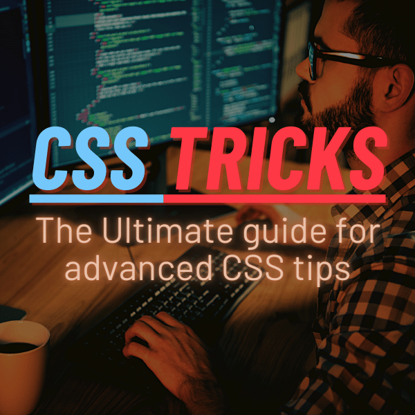
In this blog post, we will explore powerful CSS3 tips and tricks to optimize and enhance your HTML code. Learn how to create stunning backgrounds, mask images with style, and make your designs more responsive using the latest in CSS3 techniques. Get ready to elevate your website’s appearance and functionality to new heights!
Short Summary;
- Unlock your web design potential with amazing CSS3 tips and tricks!
- Create stunning visuals and captivating layouts with advanced masking techniques & gradients.
- Utilize powerful tools like Flexbox, Grids, Variables & Mixins for dynamic designs!
Mastering HTML Code with CSS Tricks

Dive into the world of CSS tricks and discover how they can revolutionize your HTML code! From optimizing background images to working with Scalable Vector Graphics (SVGs) and styling div classes, CSS tricks offer countless ways to enhance your web pages. Not only do they make your designs more visually appealing, but they also improve performance and user experience.
Another powerful CSStrick is using shorthand properties like background-image, background-repeat, and background-position to create concise and easily readable code. Combine these properties with a CSS preprocessor and you’ll be unstoppable in your web design efforts.
So let’s explore just a couple of these fantastic techniques in greater detail.
Optimizing Background Images
To optimize background images with CSS, it’s essential to choose high-quality images and the right file type. Additionally, resize images and make them scalable by using the background-size property.
Don’t forget to ensure there’s enough contrast between text and the background image, so your content remains easily readable. With these tips in mind, your website’s background images will look stunning and load quickly.
Creating Scalable Vector Graphics (SVGs)
Scalable Vector Graphics (SVGs) are a game-changer in web design. As an XML-based image format for vector graphics, SVGs offer the following benefits:
- They scale effortlessly and stay crystal clear regardless of screen resolution.
- They have higher resolution, faster speed, and better animation quality compared to PNGs.
- They are in high demand in the web design industry.
You can even animate SVGs using transitions, transforms, and keyframe animations in CSS, giving you endless possibilities for creating captivating designs.
Styling Div Classes
When styling div classes with CSS, it’s crucial to follow best practices such as:
- Using semantic class names
- Avoiding inline styles
- Keeping your CSS organized and consistent
- Utilizing preprocessors like Sass or Less
- Following a style guide
- Using naming conventions like BEM to keep your CSS in tip-top shape
By following these practices, you’ll save time and effort in the long run.
With proper organization and attention to detail, your div class will be styled to perfection, just like your div classes.
Enhancing HTML Elements with CSS Code
CSS code can breathe new life into your HTML elements by adding exciting effects like text animations, drop-shadow properties, and single-line background property declarations. One great example is the truncate strings CSS trick, which prevents text from overflowing its container and adds an ellipsis at the end.
By experimenting with various css-tricks.com properties, you can enhance your HTML elements and create a more engaging user experience.
CSS Gradients for Stunning Backgrounds

CSS gradients are a fantastic way to create visually appealing backgrounds that transition smoothly between two or more colors. With linear and radial gradients at your disposal, you can craft eye-catching designs that not only look incredible but also load quickly for an enhanced user experience.
Let’s dive into these two types of gradients and see how they can elevate your backgrounds to new heights.
Linear Gradients
Linear gradients create a stunning smooth transition between two or more colors, making them perfect for backgrounds that need a touch of flair. When using linear gradients in CSS, consider the contrast between background and foreground colors, as well as the direction and color stops of the gradient.
With the right approach, linear gradients can transform your designs and captivate your audience. They can be used to create a sense of depth, add visual interest, and even create a sense of depth.
Radial Gradients
Radial gradients blend colors in a circular pattern, adding depth and dimension to your web design. To ensure that your radial gradients look amazing and don’t detract from your content, use transparent shapes or shapes with low opacity.
By combining radial gradients with other design elements, you can create mesmerizing backgrounds that leave a lasting impression on your users.
Advanced CSS Masking Techniques
Dive into this CSS tutorial advanced focused on specialized masking techniques to elevate your professional portfolio. Unearth groundbreaking methods such as raster image masking, gradient, and SVG masking, and take your website designs to the next level of innovation.
Let’s explore these advanced CSS tutorial techniques in more detail to see how they can revolutionize your creative output.
Raster Image Masking
Raster image masking is an extraordinary method that leverages an image as a masking layer, enabling you to craft distinctive visual effects. By utilizing the mask-image property in CSS, you can forge captivating designs guaranteed to mesmerize your audience.
For optimal outcomes, make sure to select high-quality images and appropriate file types.
Gradient and SVG Masking
Gradient and SVG masking is a versatile technique that uses a gradient or SVG as a mask layer to create elaborate effects. With this method, you can build intricate shapes and designs that are not only visually appealing but also scalable and easily animated.
Embrace the power of gradient and SVG masking to enhance your designs and make them truly memorable.
Utilizing CSS Preprocessors

CSS preprocessors like Sass and Less can significantly improve your CSS workflow and efficiency by offering powerful features such as:
- variables
- mixins
- loops
- conditionals
By incorporating CSS preprocessors into your web design process, you’ll be able to write more organized and maintainable code, saving you both time and effort.
Let’s explore some of the key benefits of using preprocessors and how they can streamline your CSS development.
Variables and Mixins
Variables and mixins are essential tools in CSS preprocessors that can make your code more efficient and maintainable. Variables allow you to store values that can be reused throughout your stylesheet, while mixins let you group a set of CSS declarations for reuse.
By implementing variables and mixins in your CSS, you’ll be able to quickly update values across your entire stylesheet and keep your code clean and organized.
Loops and Conditionals
Loops and conditionals are powerful programming structures that can be used in CSS preprocessors for more dynamic and flexible styling. While CSS doesn’t have built-in loop structures, you can use the counter() function to increment based on DOM-related conditions and implement loops in your code.
Although CSS doesn’t support if-else conditions, there are exciting alternatives like the @if directive in Sass, the :not() selector in CSS, and the switch statement in JavaScript. By mastering loops and conditionals, you can create even more complex and captivating designs.
Text Transformation with CSS

Transforming and styling text with CSS opens up a world of possibilities for enhancing the appearance and readability of your content. Here are some techniques you can use:
- Changing the case of text with the text-transform property
- Aligning text for better readability
- Adjusting the spacing between letters and words
- Adding drop shadows or outlines to text
- Applying different fonts and font sizes
- Adding text effects like underlines, strikethroughs, and highlights
CSS offers a variety of techniques to make your text more engaging and visually appealing, and with the right CSS tips, you can enhance your website’s design even further. One such tip is to choose an appropriate font family for your text. When starting a new project, don’t forget to include the “doctype html” declaration at the beginning of your HTML file to ensure proper rendering and compatibility across different browsers.
Let’s delve into these text transformation techniques and see how they can improve your designs.
Uppercase, Lowercase, and Capitalize
Changing the case of your text using the text-transform property can greatly improve your design’s readability and overall appearance. Whether you need uppercase, lowercase, or capitalized text, the text-transform property allows you to easily modify the case of your content.
By using uppercase, lowercase, and capitalize consistently and appropriately, you’ll create a more polished and professional-looking design.
Aligning Text for Better Readability
Aligning text with CSS is essential for ensuring better readability and a more polished appearance. The text-align property can be used to align text to the left, right, center, or justify, giving you complete control over your design.
Additionally, Flexbox can be used for vertically centering text by setting the display property to flex and the align-items property to center. By mastering text alignment techniques, you’ll create designs that are not only visually appealing but also easy to read.
Shape Outside Property for Creative Layouts
The shape-outside property in CSS is a powerful tool that enables you to create unique and creative layouts by defining shapes and combining them with images. This property allows for wrapping content around custom paths, giving your designs a distinctive and visually engaging appearance.
Let’s explore the different ways to use the shape-outside property and create truly captivating layouts.
Defining Shapes

To define custom shapes using CSS properties, you can use functions like:
- circle()
- polygon()
- inset()
- ellipse()
The shape-margin property can also be used to create more room between an element and the content, ensuring your design remains uncluttered and visually appealing.
Experiment with different shapes and functions to create unique and attention-grabbing layouts.
Combining Shapes with Images
Combining shapes with images using CSS allows you to create visually appealing and creative layouts that truly stand out. By using transparent shapes or shapes with low opacity, you can create interesting visual effects without overwhelming the image. Additionally, ensure that the image remains easily recognizable and that the combination of shapes and images doesn’t make the design too busy or cluttered.
With the right balance of shapes and images, your designs will be both eye-catching and visually stunning.
Responsive Web Design with CSS Tricks
Implementing responsive web design using CSS tricks like Flexbox for vertical alignment and CSS Grids for fluid layouts ensures that your website looks great on any device and screen size. By utilizing these tricks, you can create designs that are flexible, adaptable, and visually engaging for all users.
Let’s examine these responsive web design tricks and see how they can enhance your designs.
Flexbox for Vertical Alignment
Flexbox is an incredibly versatile CSS property that allows you to align elements vertically, horizontally, or both. By using the align-items property to set the default alignment for items inside the flex container and setting the height of the container element, you can achieve perfect vertical alignment with ease.
Flexbox simplifies layout control and makes it easy to create stunning, responsive designs. It is a great tool for web developers and designers alike, allowing them to create beautiful websites.
CSS Grids for Fluid Layouts
CSS Grids are an exciting way to create responsive and fluid layouts that adapt seamlessly to different screen sizes. By using media queries to adjust your layout based on screen size and setting different breakpoints for different screens, you can create a design that looks incredible on any device.
With CSS Grids, you can build complex and dynamic layouts that are both visually appealing and user-friendly.
Summary
In this blog post, we’ve explored a variety of CSS tricks that can transform your web design, from optimizing and enhancing your HTML code to creating stunning backgrounds and fluid layouts. By mastering these techniques, you’ll be able to create visually appealing, responsive, and engaging designs that captivate your audience and elevate your website to new heights. Now it’s time to unleash your creativity and let the magic of CSS tricks transform your web design!
Frequently Asked Questions
What are CSS tricks?
CSS tricks are essential techniques to help developers create more efficient and organized code, empowering them to build powerful webpages quickly and effectively. They range from clever shorthand properties to more complex background and animation techniques.
Knowing these tricks can truly give developers an edge!
How do I write CSS like a pro?
Write clean and organized code, use plug-ins to speed up the process, reset CSS default values, use meaningful names, comments, and variables to keep your code organized – these are key tips to writing CSS like a pro.
Organizing your code is essential to writing CSS like a pro. Utilizing plug-ins can help speed up the process, while resetting CSS default values can help ensure that your code is consistent. Additionally, using meaningful names, comments, and variables can help keep your code organized and easy to read.
Who made CSS tricks?
Chris Coyier, with a team of Geoff and Robin Rendle, founded CSS Tricks to share their passion for the developer community with fellow developers and web designers.
They wanted to create a platform to discuss and share ideas, tips, and tricks related to web development and design. They wanted to create a space where developers and designers could come together to learn and grow.
The website has grown to become a website.
What is the advanced level of CSS?
Experience the power of advanced CSS – it enables you to create stunning, highly responsive websites that impress employers and clients alike.
With these tools and techniques, anyone can craft a visually appealing website that works seamlessly on any device.
Cool things to do with html and css?
Start your web development journey by creating amazing HTML and CSS projects! Challenge yourself to design unique layouts, experiment with colors, and try new techniques for a fun and creative coding experience.
Take the time to learn the basics of HTML and CSS, and then move on to more advanced topics like JavaScript, jQuery, and Bootstrap. With that in mind.


One Comment
Ottimo articolo, molto esaustivo!
Ho letto con piacere ripassando qualche nozione che non uso da un po’. Stavo cercando il modo di far ripetere un animazione ogni volta che l’utente scorre un punto specifico della pagina. Come potrei fare?
Grazie anticipatamente per l’eventuale risposta.